Delving the National Geographic Archive
Creating a story you experience through digital optical illusions.
The Project
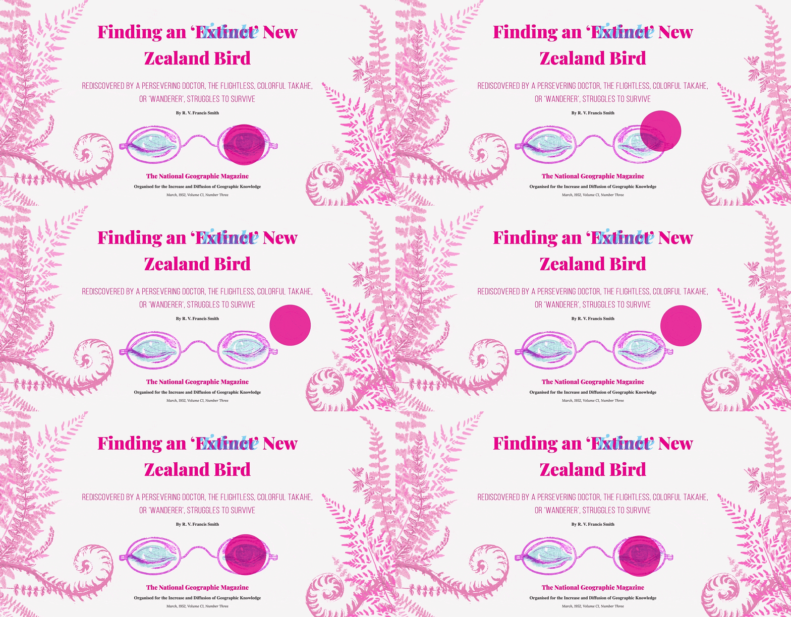
Transforming a 1952 National Geographic article into a narrative web experience for the modern day using an optical illusion that, just like the content, predates the internet. Replacing the cursor with a red reveal lens changes readers into active participants, bringing new engagement to archived content and create a story you can experience.
Details
- ROLE: Art direction, illustration, and web development
- TOOLS: Photoshop, HTML, CSS, JavaScript
- MADE TO THE SOUND OF: Panic! At The Disco - Death of a Bachelor
The Goal
Transform a 1952 National Geographic article into a narrative web experience for the modern day, bringing new engagement to archived content.
The twist: Tight timeline and zero extra budget leaves no room for high-tech solutions. I need to figure out how to create an immersive experience in your browser out of nothing but a 60 year old magazine article and some black and white photos.
Process
The narrative is compelling: a mysterious bird, a living fossil, thought lost to time, and one man’s lifelong quest to prove it still lives. My inner zoology geek could not be more excited. At least, once I got over a mini heart attack of seeing the endangered Takahe bird, the star of the story, and realising it looks like the birds I used to run after as a child in New Zealand (fortunately frantic googling revealed those to be pūkeko/swamphen, not Takahe or critically endangered, to my immense relief).
- Immerse in the source material: The existing narrative had to stay intact but the content could be abbrievated. It was not written with a modern audience on their phones in mind so I needed to study it for areas to highlight and hook readers. Further research turned up original archive footage of the expedition and longer versions of the article, for additional clues to include and flavour.
- Transform readers into participants: To be successful, the experience needed to immerse people, not be another unread article. I studied immersive narrative techniques across web experiences, games, films, and news to disect what worked. The approach: leverage the medium to take a story beyond words and visuals and into the interaction so people do not simply read but experience the story.
- Prototype, test, and prototype again: Navigating challenges meant prototyping. LOTS of prototyping. From illustrations to iterating on code, quickly prototyping the simplest possible version of the latest concept made it easy to test with users as well as avoid costly mistakes on a tight timeline.
Solution (and alternatives)
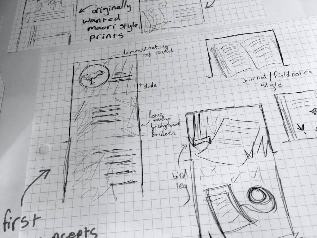
How do you transform an article from something you read to a story you experience? I knew to succeed the piece needs to become interactive to engage. Static illustations only go so far (even the old magazine had those). I considered options around found footage, using the original documents and footage, as well as a game-like approach to retracing the expedition through the portal of your browser. But with deadlines looming, there was no time or budget to create at that scale.
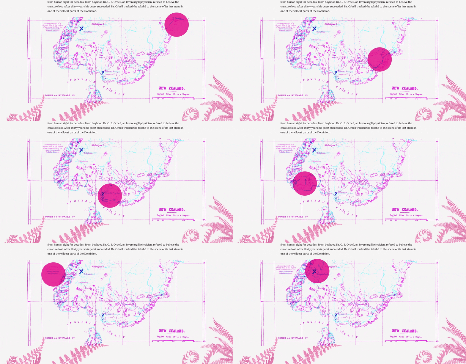
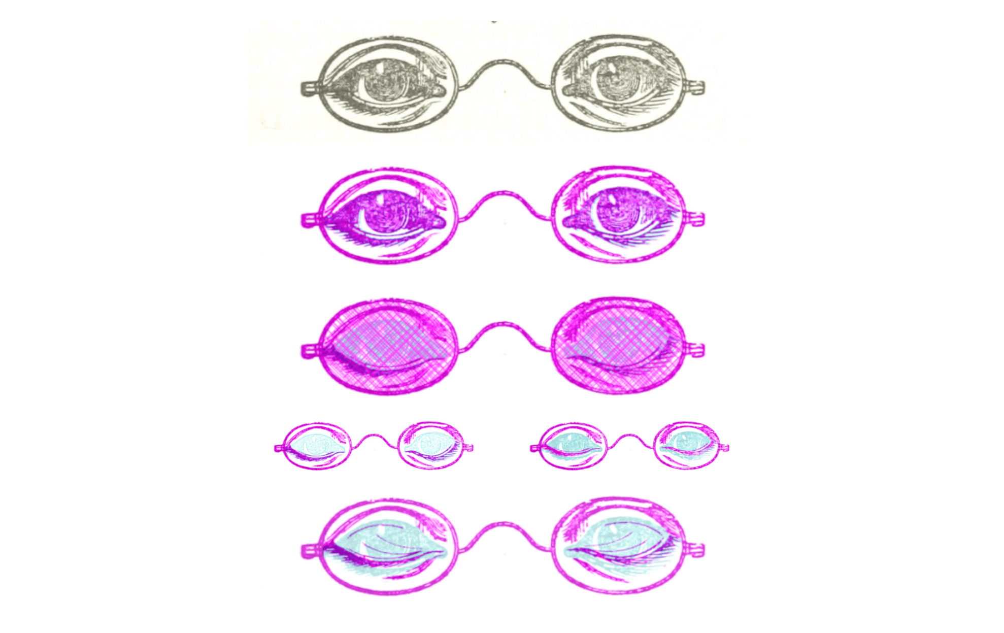
So I stopped thinking about the how and went back to basics: what is the story about? What experience should users leave with? What about putting the user into the role of the protagonist: a modern day investigator on the trail of the legendary bird. How? With every detective’s tool: a magnifying glass. Or in this case, the lens. A red lens from an old technique perfect for making the unseen seen: red reveal. An old technique and optical illusion where CMYK extremes can be employed to exclude certain hues depending on how they are layered. And just like the article, the technique predates the internet and can be accomplished with nothing but a bit of photoshop and JavaScript. User friendly + budget friendly = win.
Challenges
- Deconstructing (to reconstruct) an optical illusion for the web: When the visual narrative is driven by an interaction, expect that interaction to cause problems. Identifying the optical illusion red reveal and breaking down the principles behind the effor to bring it to screens took hours of research.
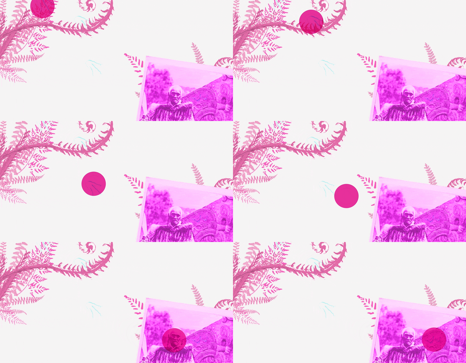
- Designing for accessibility and across platforms: The lens cursor proved trickier than thought (thankfully identified early through prototypes), needing to work on touch-based devices while ensuring the content remained accessible and enjoyable whether you use the cursor or not.
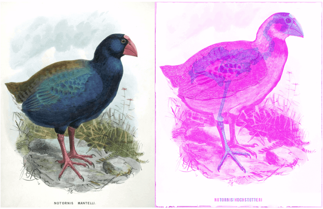
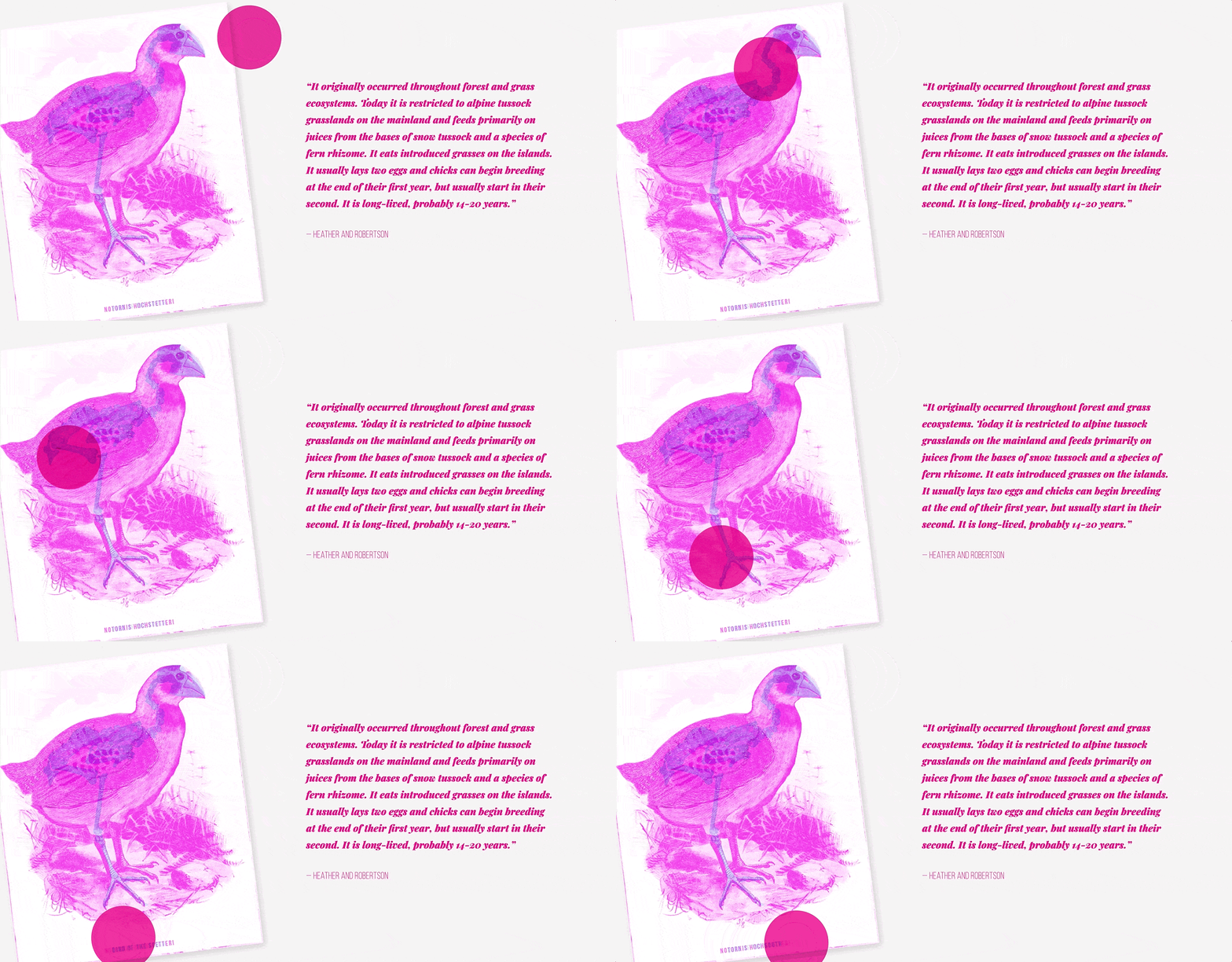
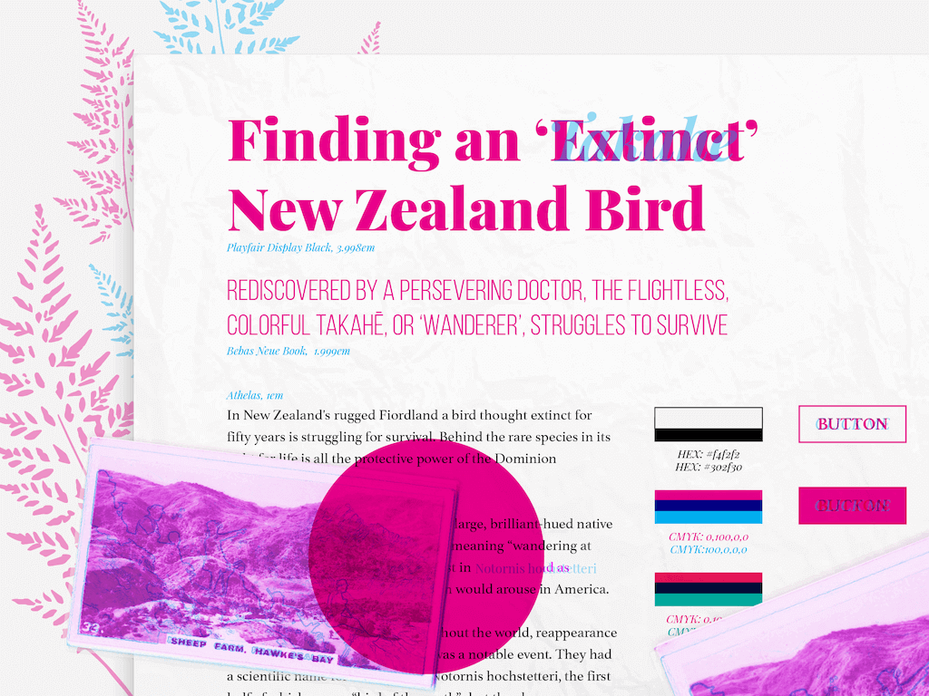
- Pivoting to a new illustration style: Turns out red reveal reveals rather than hides (who knew?). Testing the first illustration with a prototype caught the issue before any effort was waster but meant the original, hand-illustrated plans had to be tossed out that window because there was no time or budget to create the level of detail necessary to achieve the effect. Limitations inspired a better solution: the original, black and white photographic style of the magazine update to surreal CMYK colours for optical illusion-ready images. Finding and disecting public domain, vintage photography to create the hidden clues required experimentation but ultimately produced a better (and on time) results.
- Balancing projects and timelines: Tight timeline while balancing other projects with higher priorities. There was little room for error so prototyping was essential to quickly test ideas.
Outcome
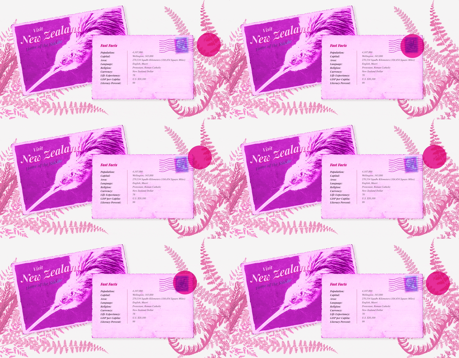
The final article brings a piece from 1952 to life for the modern world. Strange hues enhance the exotic atmosphere of the New Zealand landscape, contrasted with vintage photographs which hide clues to the mysterious bird waiting to be revealed by the lens. Every element tells a story. The article itself is abbreviated from the original, optimal for shorter reading time (and shorter attention spans, because you know we’ve all got them). The ‘secrets’ in the images and texts enhance their sections of the story and include additional details from the extended article which reward a thorough search but don’t diminish the experience if they’re missed. The reader is in the role of the investigator and may experience the story their own way.
Biggest Takeaways
- Start with the story: The project's constraints bred creativity by forcing me to go back to the themes of the narrative and figure out how to deliver an experience that weaved the story into every element rather than starting from a particular technology or preconceived notion.
- Every element tells a story: A narrative is not just what you read, it's in everything part of what you see, do, smell, taste, and touch. The unique aspects of a medium, such as the cursor in a browser, can be leveraged to create a story that is not simply read but experienced.